New Corporate Logo
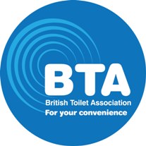
New BTA Logo announced by Management Committee
After around fifteen months of research, consultation and deliberation the BTA Management Advisory Committee has finally selected a new corporate logo to help the BTA update its image, appeal and visibility. As with the old image the new logo will very quickly become recognised as an industry standard.
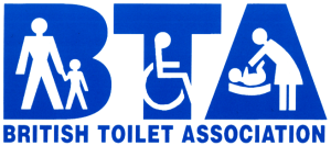
Extensive testing and questioning of the friends, colleagues, the public and other interested parties brought to light a number of changes that needed to be addressed. Concern was raised that the current logo seemed to be non-inclusive as it clearly showed; a man holding a child’s hand, a single wheelchair user and a female changing a baby. The association works and campaigns for an ever increasing number of user groups and so it was agreed by the committee that we should no longer use an image that only highlighted a small fraction of the groups we endeavor to support.
The working and design criteria that was set then was to recreate a logo and offer up an image that was:
- easily recognisable and quickly identified – as before
- carried a simple strap-line message
- modern, clean and smart
- could be easily recreated on all media
- would allow future merchandising
The original strap-line considered was “At your Convenience” but this was recently superseded by “For your Convenience” offering the reader or potential customer a marketing opportunity to bring the BTA in to help with toilet related problems and dilemas.
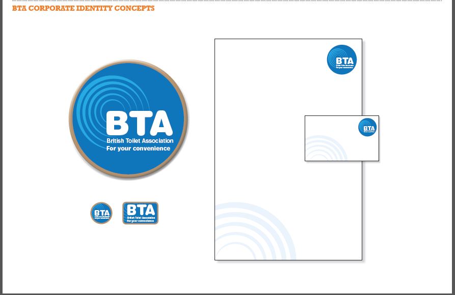
Above is the final concept design that was selected and agreed by the Management Committee and this image will now be attributed to all future printing and design publications. The new design will be systematically incorporated into the organisations marketing materials over the next few months.
The previous logo will remain protected and be maintained in house for record and reference purposes.


